Amazon,
I love what you have done with turning basic web services (most recently sending batch emails) into a -pay-as-you-go Utility.
But really, you need to simplify your dashboard and reporting.
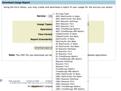
Do you seriously expect me to not be confused by this one menu - not to mention it is one of 4 and the others are almost equally as daunting.
Help me help you. I want to continue using your services, but if your interface continues being like this and Apple moves in - unfortunately you will turn into the ‘ex’.
So before that happens, don’t give them the opportunity. Spend some money on a great design team to simplify this and present it easily.
Thanks.
You can follow me on Twitter here.
